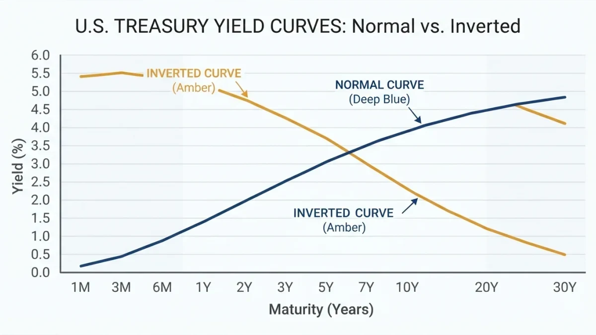

A yield curve inversion is a condition in which shorter-dated Treasury yields rise above longer-dated ones, reversing the Treasury market's normal upward slope. It preceded every U.S. recession since 1955 except in 1966, per Federal Reserve research, and the most recent 2-year/10-year inversion, from July 2022 to September 2024, was not followed by a declared recession through mid-2026.
The yield curve is a market measurement, not a directive; nothing in its history tells any reader how to position a portfolio, and interpretation depends on conditions that change with each cycle.
What is a yield curve inversion?
The yield curve plots Treasury yields from 3-month bills out to 30-year bonds on a single line. It normally slopes upward, because lending money for longer periods involves more uncertainty and usually earns more yield. An inversion reverses that arrangement: a 2-year note, for example, yields more than a 10-year note.
Traders watch several pairs. The 2-year versus 10-year spread is the media's standard reference, while the 3-month versus 10-year spread is the measure most used in academic recession models, including the probit framework of Federal Reserve economists Arturo Estrella and Frederic Mishkin, whose 2006 study documented the indicator's record.
Why does the curve invert?
Inversions are mostly an expectations phenomenon. Long-term yields embed the path of short-term rates investors expect over the life of the bond. When the Federal Reserve raises short rates sharply and markets expect those hikes to slow the economy, expected future rates fall, pulling long yields below current short ones.
A second component is the term premium, the extra compensation investors demand for holding long maturities. In episodes where the premium is compressed — as it was through much of the 2010s — a given expectation of rate cuts is enough to push the curve flat or inverted. The inversion therefore aggregates what the market expects the central bank to do and how much risk it prices for holding duration, which is why identical-looking curves can carry different implications.
What did history show after past inversions?
| 2s10s inversion period | Recession that followed | Approximate lag |
|---|---|---|
| 1988 to 1989 | July 1990 to March 1991 | About 18 months |
| 2000 | March 2001 to November 2001 | About 12 months |
| 2005 to 2007 | December 2007 to June 2009 | About two years |
| 2019 | February 2020 to April 2020 | About six months |
| 2022 to 2024 | None declared through mid-2026 | Not applicable |
The 2022 to 2024 episode deserves its own note. The 2-year/10-year spread inverted briefly in April 2022, then continuously from July 2022 until September 2024 — the longest stretch in the available daily data for that pair — and reached roughly minus 108 basis points in July 2023, its deepest reading since 1981, per Treasury market data compiled at the time. The curve returned to positive territory in September 2024 around the Federal Reserve's first rate cut of that cycle, and the National Bureau of Economic Research, which dates recessions, had not declared one through mid-2026.
How reliable is inversion as a recession signal?
Three limitations recur in the research. First, false positives exist: the 1966 inversion passed with no recession, and episodes of partial inversion have produced downturns only sometimes. Second, the lag is long and variable, from roughly six months to two years in the table above, which makes the signal hard to act on even when it is right. Third, confounds distort recent readings — the 2019 inversion was followed by a pandemic-driven recession that no bond market priced.
The 2022 to 2024 episode added a fourth caveat: an inversion driven by aggressive rate hikes in a resilient economy can simply reflect a high starting policy rate. Estrella and Mishkin's own framing treats the curve as an input to probability estimates, not a clock, and the Federal Reserve research program that followed their work reports probabilities, not dates.
What do analysts watch alongside the curve?
Practitioners read the curve next to decompositions that split long yields into expected rate paths and term premiums, such as the Adrian-Crump-Moench model maintained with Federal Reserve data. The direction of re-steepening also carries information: an inversion that ends because short yields fall reflects expected policy easing, while one that ends because long yields rise reflects growth or inflation repricing, and the two imply different environments.
For households, the practical relevance is narrower than the headlines suggest. Mortgage and corporate borrowing rates key off the long end, so curve shape affects financing costs mainly through the level of long yields, not through inversion itself. That framing has practical consequences. A household deciding on a mortgage in an inverted market faces long rates set by the long end of the curve, which an inversion tends to hold down; a saver rolling short-term deposits earns the elevated short end instead. Neither fact follows a rule — both trace back to where yields sit, which the curve's shape only summarizes. The indicator's value is as one documented summary of expectations among many, to be weighed rather than followed.to be weighed rather than followed.